You can only communicate brand awareness to your users so much through written content. Catchy call-to-actions, unique slogans, and pretty fonts are eye-catching and keep users’ attention, but what really makes your brand stand out? Color.
Color is everywhere. As humans, we associate colors with feelings, thoughts, emotions, and memories. It’s no wonder that certain colors can illicit different or even similar reactions in people. Our team at Webspec knows the importance of color for web design, but how exactly do we determine those colors? What thoughts go behind picking color palettes for your brand? Here are a few key thoughts to keep in mind on the importance of color in your brand identity.
Picking a Color Palette That Works For Your Brand
Emphasize Your Brand’s Goals
Your brand is the person that the public sees and color is essentially the outfit that your brand wears. Color can determine the personality that your brand is going to have and portray. A client we had the pleasure of working with, Brass Armadillo, is a chain “mall” that sells antiques and oddities. Their colors are more vintage yet warm and welcoming, so we went with a nice oatmeal color to tie all the colors together, with jewel tone accent colors, a deep red, a mustard yellow, and an emerald green.
In print, there were very few colors available before technology made vibrant colors accessible, so sticking with a primary color palette is a nod to the past. One of Brass Armadillo’s goals as a brand was to reach a younger audience, so it was important to keep the colors fresh while also on the brand which provided a fun challenge.
We decided on yellow to be the primary color within the palette because yellow is a pretty, fresh color that emulates energy and optimism.

Go Back to Your Roots
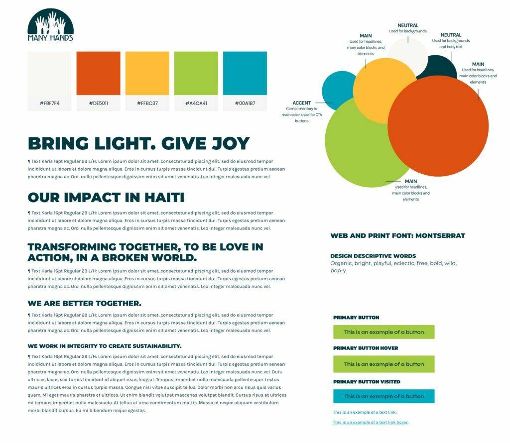
If you are a brand with an extensive business history or perhaps you have a unique story, going back to the “roots” can really help in communicating your mission. We worked alongside Many Hands for Haiti to help them communicate their passion for their mission with the goal to design something fun, yet professional for their site. With a pre-determined brand kit, we had some flexibility in what colors we could choose.
In order to stay true to the promise of emulating Many Hands’ mission of “Transforming together, to be love in action, in a broken world,”— incorporating the culture of the people they serve was a big priority. In research into traditional Haitian art, a common finding was the use of very saturated, bright colors. However, to keep it professional, these colors are used as accents rather than being the main “show” throughout the site and taking away from the user’s experience.

Using Your Brand’s Colors to Emphasize Content
Content continues to reign as king in the digital world, and using your brand’s colors incorrectly can draw away from that. For our client, Campbell’s Nutrition, their color palette as a brand is fun, and whimsical—giving off a modern “pop art” vibe that communicates well with their targeted audience. While their palette is fun to work with, we want to make sure we are using color to communicate their key content and messaging. By using more opaque and saturated colors either behind the content or highlighting content, color can draw the eye down the page easier for the user.

For some brands working within more “professional” industries, their color palette may have little to no variance. This can prove to be difficult when trying to convey messaging to their users. Not enough color can communicate dullness or an unapproachable demeanor in the voice and tone of the content. Too much color can communicate disorganization or confusion.
Make Sure Your Brands’ Colors Are Accessible
Color is incredibly important when it comes to accessibility. Not only is accessibility a big factor in online digital marketing and websites through SEO, but you always want to make sure you’re being inclusive to those who have disabilities or impairments. At Webspec, we always keep in mind that our sites will be viewed by a very diverse group of people. Making sure text is readable on certain colors and making sure contrast ratios are large enough is vital.
A good rule of thumb for color contrast ratios is to have a ratio of 4.5, or “double-A”. For smaller text, you would need a higher ratio. To check and see if your brands’ colors meet the contrast ratio, we recommend this resource. Ideally, we would want to hit the “triple-A” ratio.
Revitalize Your Brand’s Identity with Colors That Complement
Whether you’re a business that already has a brand kit with a selected palette, or you haven’t quite decided yet, it’s important to nail that down to increase positive communication for your users. If you’re interested in re-branding or need assistance in creating a brand kit, our design team are experts in color.
Get connected with our team and let’s begin the journey to refresh your brand for clearer communication today!
