As a designer, color plays a huge role in any project from print to web. It can convey different emotions, speak to different target audiences, and communicate action (among other things!). If you’ve ever been curious why colors are important, here are some best practices for color in web design and insight on tools I use to help you along.
Why Are Colors Important in Design?
Contrary to what many may believe, web designers don’t just “decorate” a website. Colors are chosen on purpose and with intention. The points below aren’t mutually exclusive; they all inform each other and should be considered with every project.
Colors can convey emotion and tone
Colors can bear different meanings through different factors like pairings, shades, context, content, vibrancy, culture, location, tone, and so much more. It can even be pretty subjective, but here are some examples of what different colors portray.
- Red: powerful, emergency, life, passion, health, romance, call to action, sale
- Yellow: caution, joy, sunshine, warmth, intensity, happiness
- Blue: trust, peace, serenity, loyalty, sadness
- Green: environmental, nature, finance, health, jealousy, growth
- Orange: impulse, confidence, friendly, safety (construction)
- Purple: royalty, wealth, romantic
- Brown: stability, natural, earth
- Gray: neutral
- White: purity, clean, innocence, neutral
- Black: power, intensity, death, authority, luxury, edginess, sophistication, unknown
In general, warm colors are energetic, alert, and work well for calls to action. They come off bold, portray daytime energy, and can also be aggressive. Cool colors, on the other hand, are peaceful, calming, and tranquil. They can bring to mind nighttime and sadness.
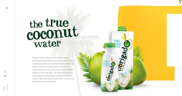
Judging from the colors on the Obrigado website, the yellow block emulates warmth, energy and joy, which makes sense because this is a product from Brazil — which has a lively culture and warm/tropical temperatures. The green elicits a natural aspect and the white emphasizes purity and cleanliness. The design is bold, but not overwhelming, while playful and informative.

Colors can highlight features or create focus
For projects with a minimal color palette, utilizing a strong primary (or priority) color can pack a lot of meaning and also create focus and highlight features.
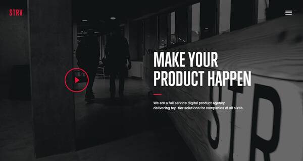
Colors can make something visually pleasing
This is inevitable when you can find a balance between aesthetic and function.
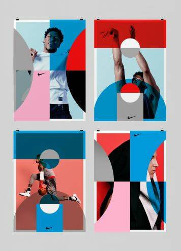
This series of posters by Studio Feixen is visually pleasing; the colors are pleasant and playful. But the colors along with the shapes also help isolate specific body parts, motion, and, strength through placement and visual language.

The pastel colors on the Traditions Children’s Centers website complete the playful nature of the website that is focused on children created a visually pleasing aesthetic with the juxtaposition of the photo, type choices, and darker, chalk background. The blue also pulls focus to the buttons on the site and reinforces the trust factor.
Best Practices for Using Color in Web Design
When it comes to web design, there are more considerations that need to be taken into account for color usage. Monitors, screen size, and audiences for websites may vary considerably from something done as a print piece, and designers need to make decisions accordingly.
Contrast is key when it comes to web design
Make sure text and graphics are readable and don’t strain the viewer/user’s eye — and consider Americans with Disabilities Act (ADA) compliance in terms of visibility. The goal of compliancy isn’t to limit your design (although some may feel that way). Rather, it is to make websites inclusive and cater to every user. If you’re not sure about the contrast levels of your website, WebAIM is a good tool to use to check contrast for those that are colorblind.
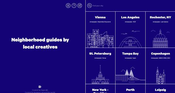
It’s easier to think of it this way: If your site was grayscale (all black, white, and gray vs. full color), would there be enough contrast to make out all the images/content? This website, On the Grid, represents one end of the spectrum; utilizing a dark color with white is usually a safe bet.
To read more about guidelines (other than color contrast) and levels go here.
It’s not all about the graphics — your content should shine
Keep it simple: Content is key in terms of websites, and colors should not distract from the main message. Content and color should work together in tandem.
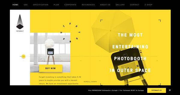
On the Fotonaut website, yellow is used a lot in a very specific way: to draw attention and create a feeling of joy, which makes you want to read more. However, the content is still the star.
Know your audience
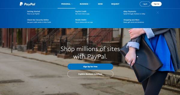
Cater to your target audience. Factors that need to be taken into consideration include demographics (age, gender, industry, location, etc.), and the feelings you want to elicit. For example, blue signifies trust and loyalty and is utilized by financial companies such as PayPal and legal services such as Fisher Law Firm.

Not Feeling Colorful?
Choosing the colors for your website isn’t always easy. When I’m stuck, here are some tools I use to get inspired:
- Sip – http://sipapp.io/
I mostly use this app as a color picker to collect and organize color palettes for clients without brand guides and to pick up colors that catch my eye. My favorite thing about the app is that you can pick up any color that is on your computer screen, so the possibilities are endless! - Adobe Color CC – https://color.adobe.com/
Adobe Color CC is a tool I use to create color palettes for branding projects. My favorite part about it is uploading a photo that will generate a color palette for you, but you can also pick and choose if you don’t like the pre-generated color palette. It’s a great tool to use when synced with Creative Cloud Libraries so you can start using it right away. - Flat Color Picker – http://www.flatuicolorpicker.com/
Flat Color Picker breaks down shades of color such as red, pink, purple, etc., in a grid format. I utilize it as inspiration, and it helps that it’s very visually pleasing. - Pinterest (moodboards) – http://pinterest.com
Pinterest is just overflowing with inspirational images and makes it easy to create and/or find moodboards that can help define a color palette and overall feeling for a branding project. I use it as a collaboration tool with branding clients to allow them to show me their preferences. As a visual person, it allows me to dig deeper into what the client is looking for and/or interested in.
- Sip – http://sipapp.io/
If you’re looking to bring some color into your website or branding, give us a call. I’d love to sit down with you and brainstorm how we can make color work for your business!
Sources:
https://blog.kissmetrics.com/psychology-of-color-and-conversions/
http://www.arttherapyblog.com/online/color-psychology-psychologica-effects-of-colors/#.WJoLdLYrJAZ
http://www.arttherapyblog.com/online/color-meanings-symbolism/#.WJoU0bYrKTc
https://thenextweb.com/dd/2015/04/07/how-to-create-the-right-emotions-with-color-in-web-design/
https://webflow.com/blog/web-design-101-color-theory
