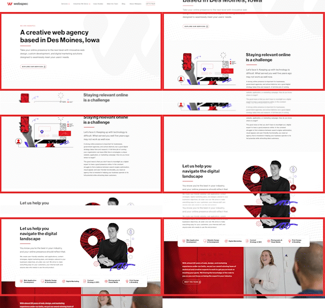
Adobe Xd
This is the tool our designers use to create wireframes, style tiles, and visual designs during a project. It’s a vector-based tool that is geared specifically for web design, and it allows designers to create mockups, animations, and user flows that will closely match the experience of a live website. Adobe files are shared with clients in links, which can be opened and viewed within any browser. This removes the hassle of sharing, saving, and version tracking of files like pdfs of jpegs. You can add and pin comments directly on the design, reducing the confusing back and forth communication for feedback and edits!
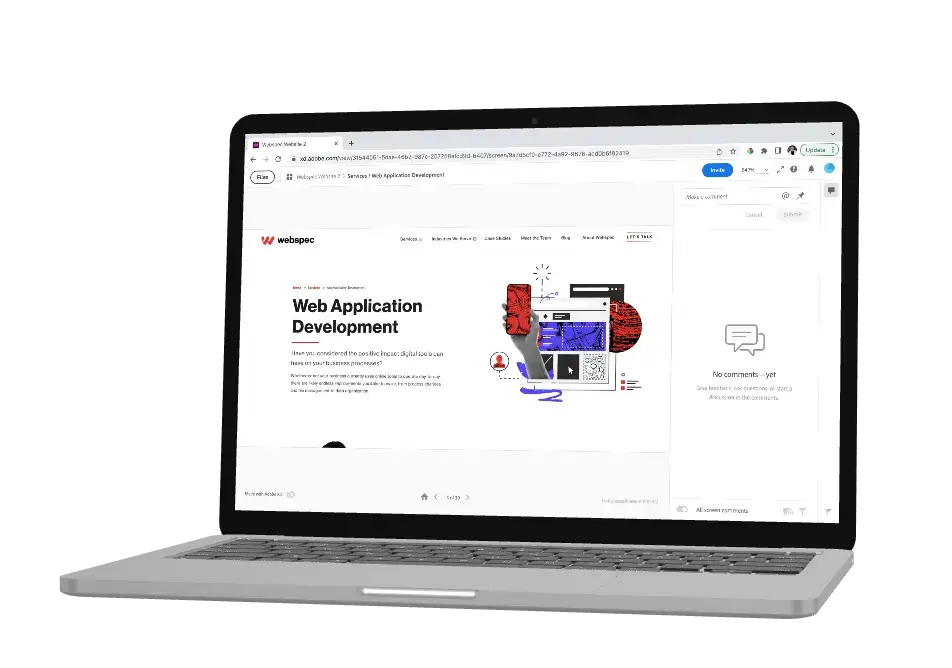
Brand Guidelines
Brand Guidelines are clearly defined rules and standards that communicate how your brand should be represented to the world. This helps ensure consistency and demonstrates what the company is, what it does and what it stands for through visual and written elements. The guidelines typically include rules or standards for logo(s), fonts, colors, graphics, imagery, voice and tone. If your company has one we’ll want to be sure we are using it so your brand stays consistent across all media, including your website. If your business doesn’t have established brand guidelines, Webspec may suggest to include this as a deliverable within the design process for your project.
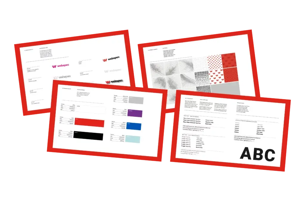
Mood Board
A collection of visual materials that evoke a certain style or concept. Examples of what you might see on a mood board are font pairings, heading styles, images or design elements.
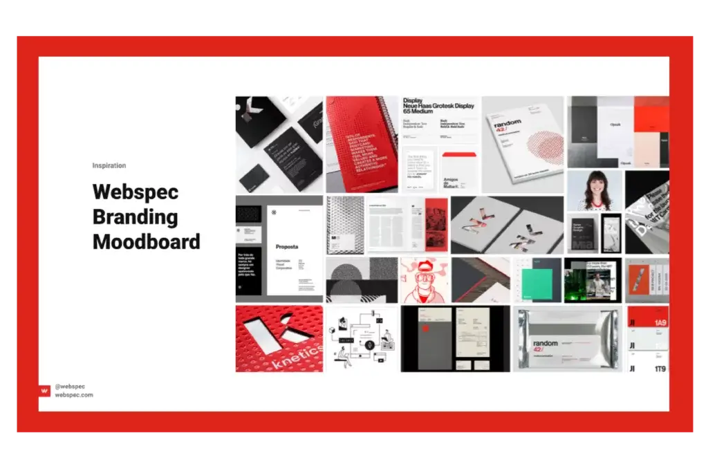
Style Tile
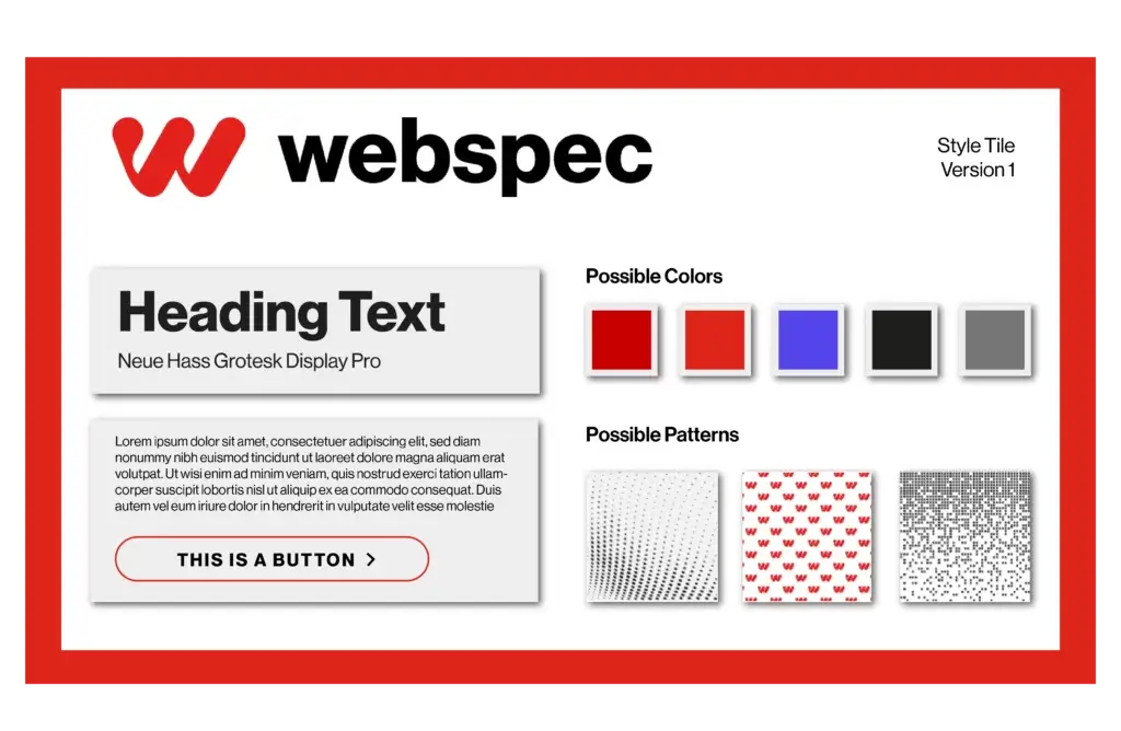
Style Tiles are a design deliverable consisting of fonts, colors and interface elements that communicate the essence of a visual brand for the web.
Design Workshop
The Design Workshop is a design focused meeting held at the beginning of the design phase. The ultimate goal of the Design Workshop is to determine the website’s aesthetics, by illustrating the overall feel of the website, building on your company’s brand, culture, voice, vision, users, and goals. We collaboratively generate a Mood Board or Style Tile, which is composed of visual or written artifacts–color swatches for primary, secondary, & tertiary colors, typography, icon styles, images, graphics, or anything that communicates the overall ‘look and feel’ of the website. The Design Workshop utilizes quick, iterative mockups to work through ideas & end at a unified vision—the key design concept, or theme—that will influence all page designs. By the end of the meeting, our designer should have a strong understanding and direction for your new website’s typography, color schemes, button stylings, and other visual elements.

Wireframe
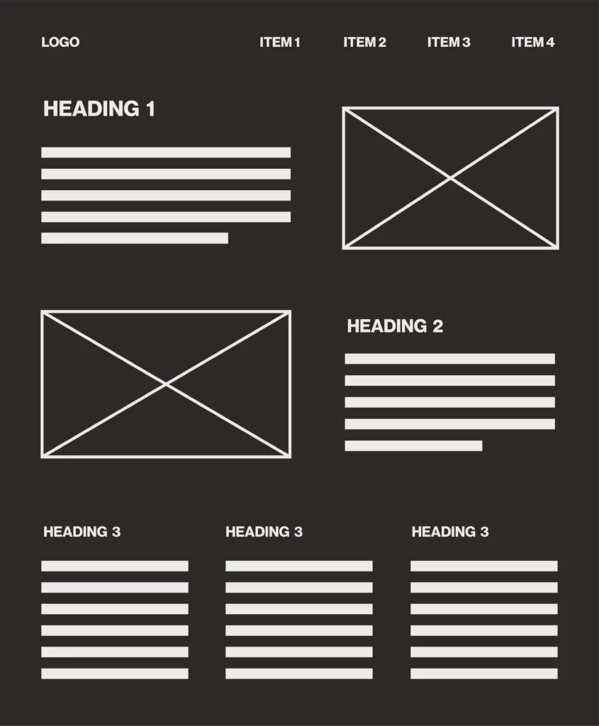
A wireframe is a representation of a web page used to showcase hierarchy and layout. It uses simple shapes, headings, and placeholder text to create a “blueprint” for a specific page, giving you an idea of how and where content will be placed on a page.
Mockup
A working sample for reviewing format, layout, or content.
Visual Designs
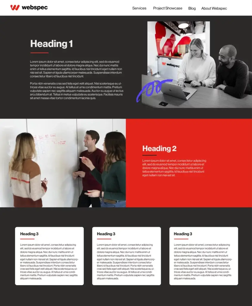
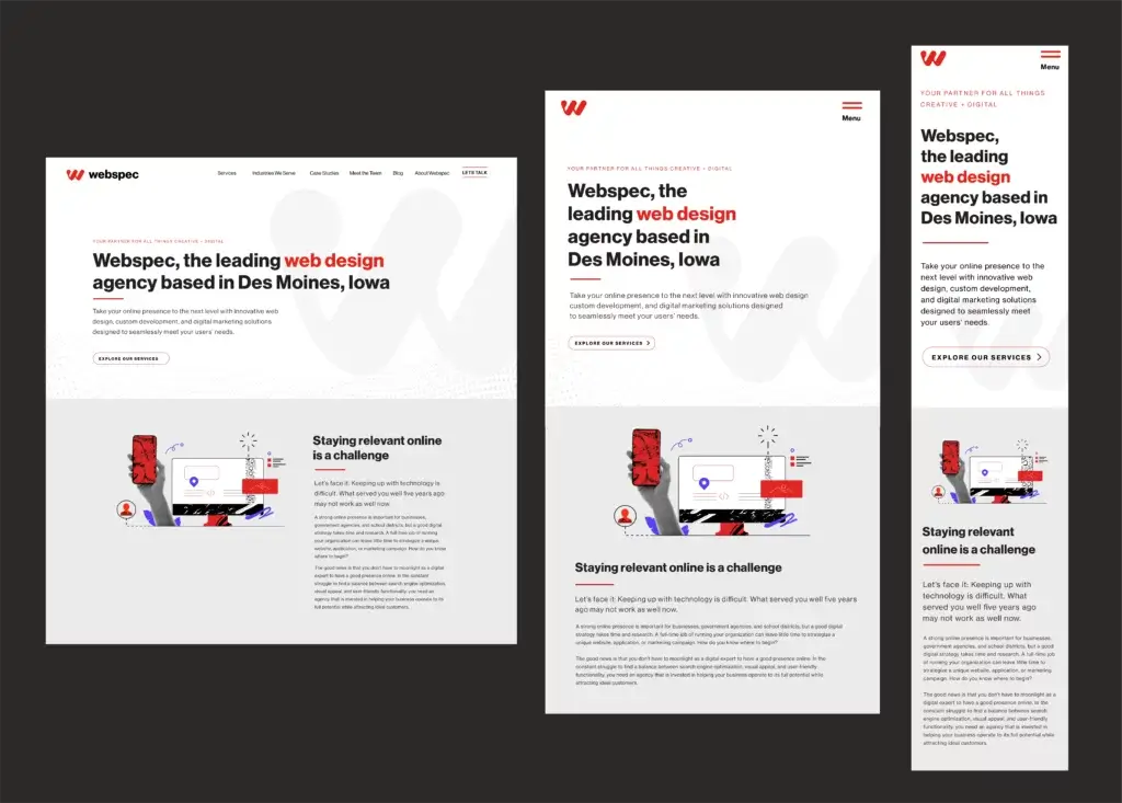
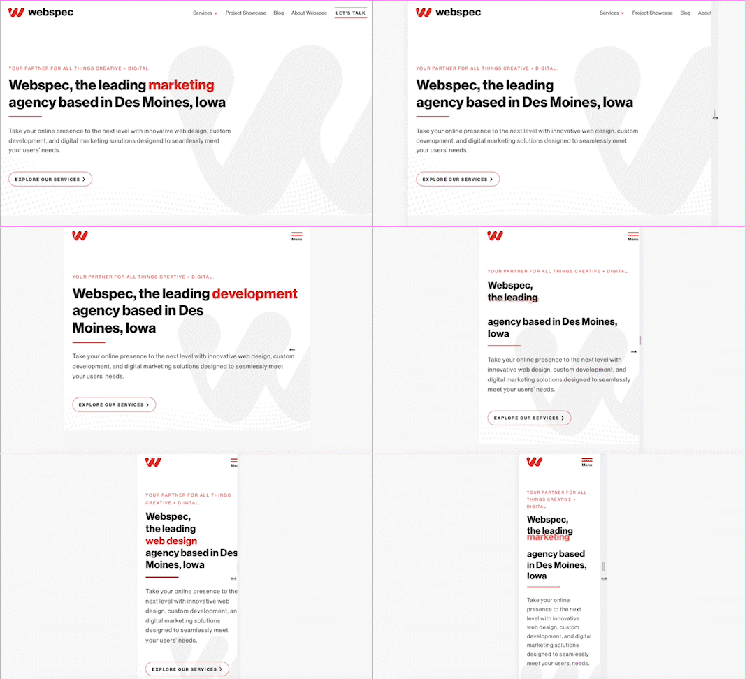
A Visual Design is a design for a web page which includes all of the finalized content and assets such as imagery, fonts, and icons. Unlike wireframes, Visual Designs have precise styles throughout such as margins and line height. These designs are used to depict a visual at a certain width, which means we often create several versions of the same page design to show what a page will look like in various pixel widths. Often, we choose specific widths to design a page in desktop, tablet, and mobile versions.
Responsive Design
An approach to building a website that considers the different types of devices that a visitor might use to access the site. Responsive web design adjusts how content and images on a page are displayed according to the dimensions of the device’s screen.
Grid
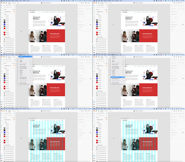
A grid is constructed from evenly divided columns and rows. The point of a grid is to help designers arrange elements in a consistent way.
Heading Styles
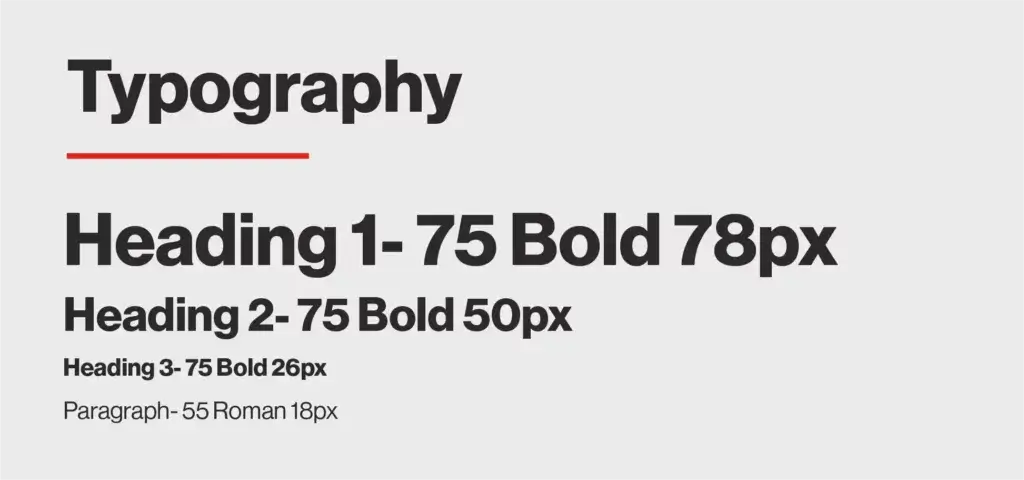
The hierarchy in which a page is laid out, consists of H1, H2, H3, etc. and paragraph text. It is a system that establishes an order of importance for your content and helps the user easily navigate through your site. The H1 of each page is considered by search engines as the page’s overall topic. Heading structure and content is analyzed by search engines as they decide how to rank your site, so it’s important to make sure all your site’s headings are descriptive and contain keywords relevant to the page topics. For clarity with search engines and for users, each page should have only one H1 and multiple H2s, H3s, etc. nested appropriately. Headings should never skip a class. For instance, if you have an H3 on the page, it needs to have a section with an H2 before it chronologically.
Lorem Ipsum
Dummy text that mimics the ebb and flow of the English language, used in designs to fill in portions of the design that don’t have content created; filler text. You may see this in your visual designs or wireframes if content for that section is still being worked on or finalized.

Hex Colors
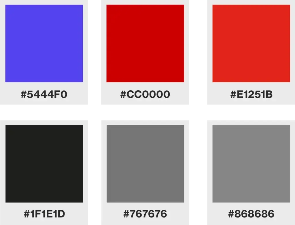
A hex is a six-digit number used in HTML, CSS, and design software applications to represent colors.
Icons
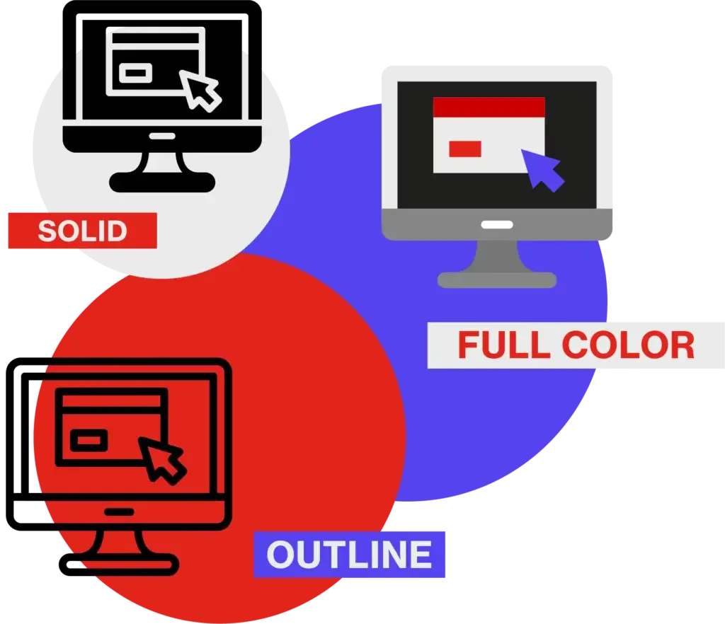
Icons are images used to represent an action or an object. For example, a pen icon could represent someone writing (action) or simply a pen (object). Can be in different styles, flat, outline, realistic, etc.
Graphics
A graphic is an image or visual representation of an object. Graphics are typically broken into two types: Raster and Vector. Both are further defined below.
Raster
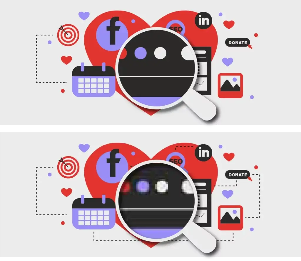
Raster images are made up of a set grid of pixels. This means when you change the size or stretch a raster image, it can get a little blurry and lose some clarity. Not ideal for web design, as your design may be viewed on different screen sizes, so the quality of your image is not guaranteed across all screens.
Vector
Vector images are made up of points, lines, and curves. All of the shapes within a vector are calculated using a mathematical equation which means the image can scale in size without losing any quality. Unlike rasters, vectors won’t get blurry when scaled. Ideal for web design since the images never lose their quality.
Resolution
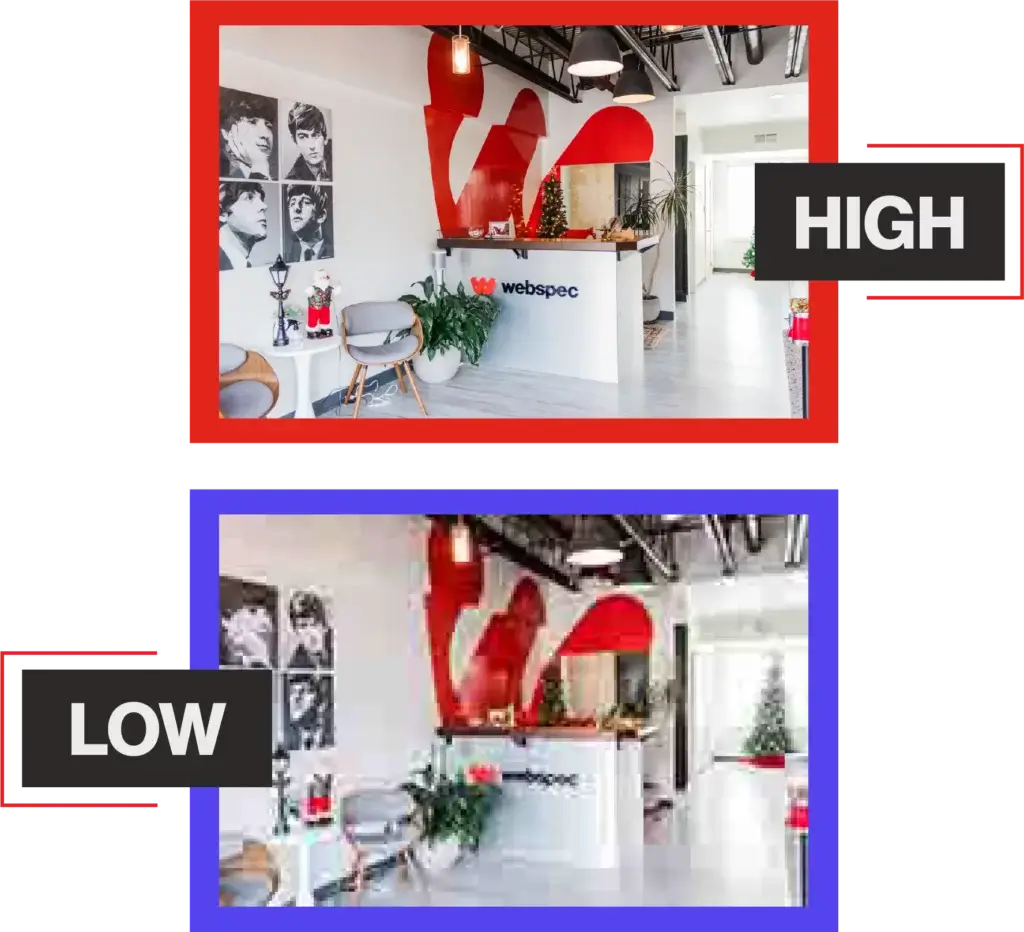
The resolution of an image determines the quality. As a rule of thumb, the higher the resolution, the higher the quality. A high-resolution image will be clear and crisp whereas a low-resolution image will feel a little pixelated and blurry.
Font
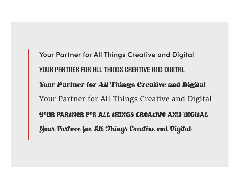
A collection of letters, numbers, punctuation, and other symbols used to set text (or related) matter. Although font and typeface are often used interchangeably, font refers to the physical embodiment (whether it’s a case of metal pieces or a computer file) while typeface refers to the design (the way it looks). A font is what you use, and a typeface is what you see. Example: Times New Roman, Poppins, Helvetica
Typeface
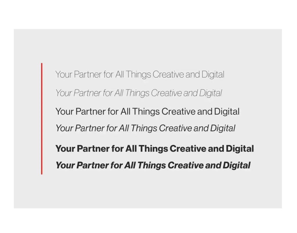
An artistic interpretation, or design, of a collection of alphanumeric symbols. A typeface may include letters, numerals, punctuation, various symbols, and more — often for multiple languages. A typeface is usually grouped together in a family containing individual fonts for italic, bold, condensed, and other variations of the primary design. Even though its original meaning is one single style of a type design, the term is now also commonly used to describe a type family (usually only with the basic styles regular, italic, bold, bold italic) Example: Semibold, light, bold, italic, etc.
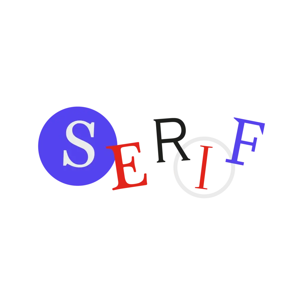
Serif
A smaller line used to finish off a main stroke of a letter, as at the top and bottom of M, sometimes called the feet of a letter. Examples: https://fonts.google.com/specimen/Merriweather?category=Serif and https://fonts.google.com/specimen/Libre+Baskerville?category=Serif
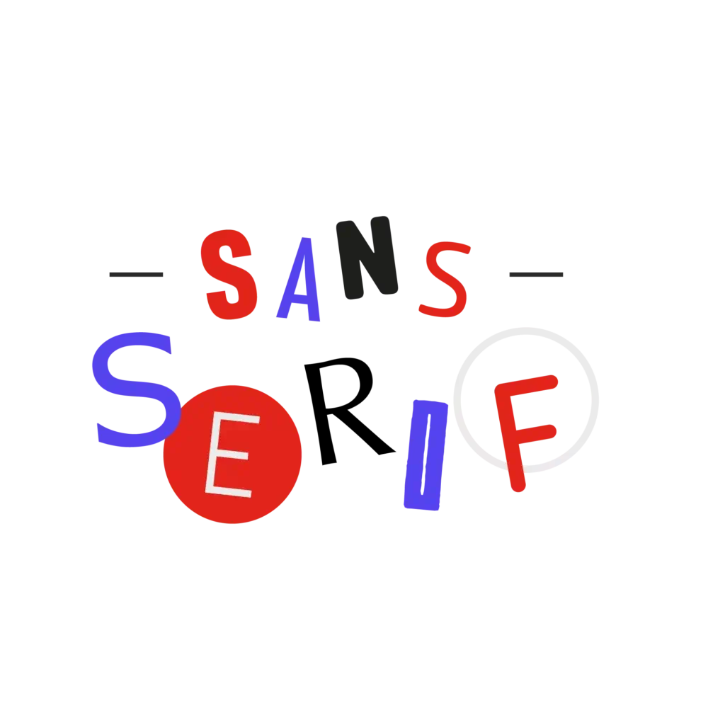
Sans Serif:
Sans letterform is one that does not have extending features called “serifs” at the end of strokes. Examples: https://fonts.google.com/specimen/Roboto?category=Sans+Serif and https://fonts.google.com/specimen/Libre+Franklin?category=Sans+Serif
ADA Compliance
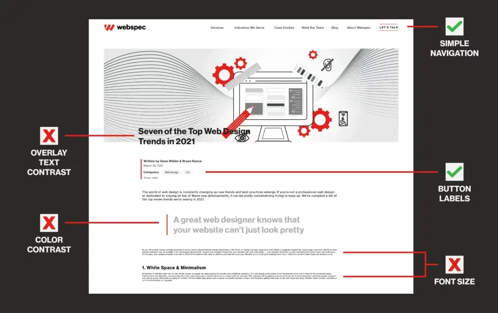
“American Disabilities Act” – The ADA has requirements, things such as color contrast ratio, button size, text size, screen readers, alt text, and more. There are 3 levels of conformance you can meet; A, AA, AAA. You can read more about the Fundamentals of Accessibility on the WCAG Initiatives website here: https://www.w3.org/WAI/fundamentals/ or in Webspec’s blog talking about WCAG 3.0 guidelines: https://www.webspec.com/2021/04/wcag-3-first-look/
Contrast
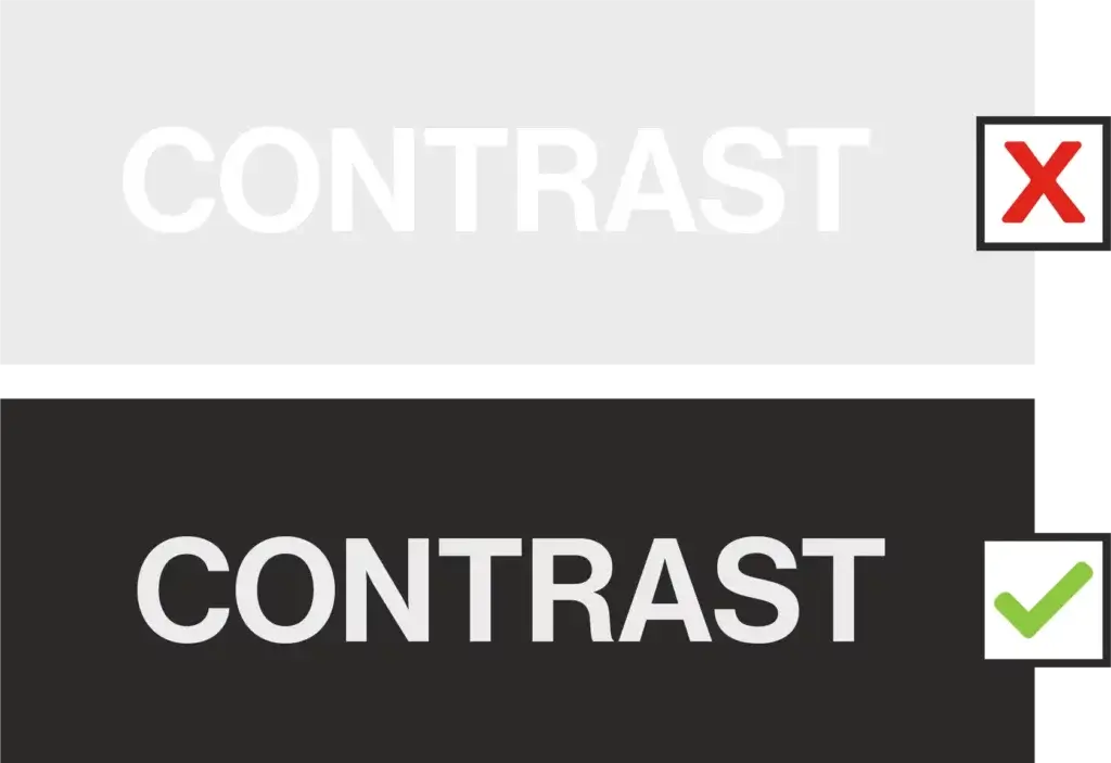
The difference in brightness between foreground and background colors. Specifically, text color on color and images.
Opacity
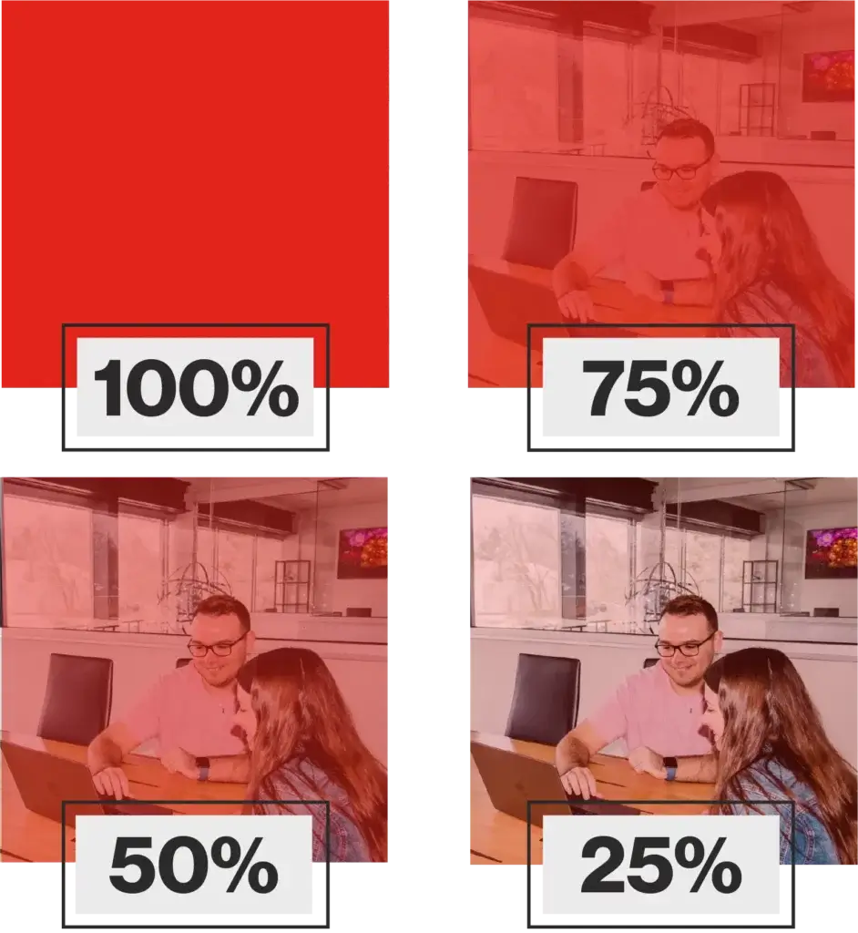
Opacity is how much light passes through an object. The lower the opacity—or the more light that can pass through an object—the lighter and more see-through it is. The higher the opacity—or the less light that can pass through said object—the more solid it is.
Parallax Scrolling
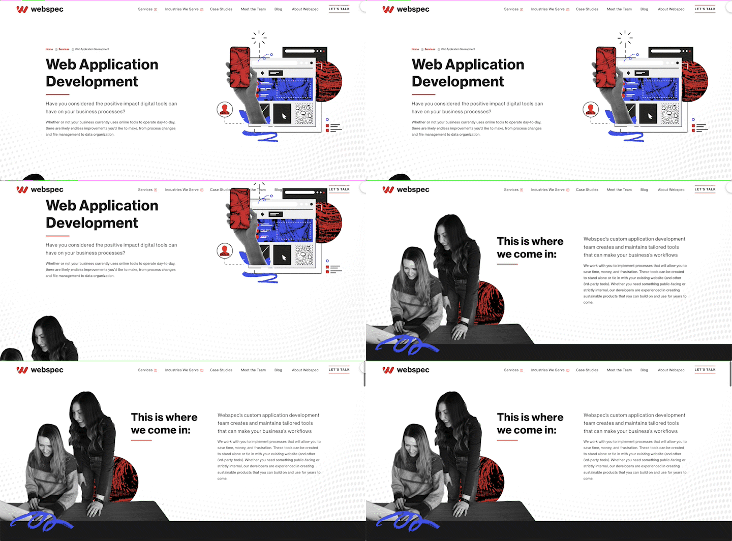
When items closer to your viewpoint appear to move more quickly than items farther away. It appears as the background image moves in the background as the text/blocks move over the top.
Viewport
A framed area on a display screen for viewing information.
